Showing posts with label Monthly Challenges. Show all posts

Monday, June 16, 2014

First Day of Vacay

Good Morning!

It's been a few days, but I have another page to share.  This time, it's my submission to Scrap Around the World.  They are new to me, and I fell in love at first sight.  Their June mood board was SO unlike my usual colors and preferences that I wanted to try it out.  It's really quite lovely:


And here is my take:


Yep, I really departed from my comfort zone, huh?  The inspiration deatils are as follows:

  • Okay, I give myself credit for at least breaking out the yellow, black and gray.  I have been holding onto that yellow patterned paper for a year, now.  It finally has a home.
  • The striped paper straws helped me choose the chevron paper base.  I had meant to show only enough that it looked like just a stripe, but I guess I was my own special "helper" when trimming the paper.
  • Those same straws inpired my choice of stitching with bakers twine.  I may not do that one again.  PITA is not just a tasty bread!

Beyond that, I was also inspired by this sketch, which is part of a Page Maps June challenge at scrapbook.com:


THAT's what's up with all of the stars.  Okay, that and I've been in a star-heavy mood lately.  They're on everything.  Also, I've been in a splatter and sequin mood.  This was extra-awesome today because it gave me a chance to use some highly unloved mists.


The light bulb!   I love that light bulb.  I bought it with dreams of using it all over The Boy's latest album.  This is the first time it made it out of the package  Even then, it was almost a no-go.  This was a final attempt to make it work, but even then, the mist ran under the mask and it was just a dark yellow, water-color kind of mess.  After it dried, the paper looked kinda cool, so I just traced the stencil bits onto the mess and fussy-cut it into something I kinda like.  I now have three more in my stash to figure out.  Somehow!  Some way!


The vellum!  I love my vellum.  That actually does get used; but I have a hard time letting any of it go un-seen.  The stamped quote above and below the photos was stamped on the cut-out center of the matting. 


That little bit of stamping in the background was basically a test run.  I started to assemble this page one week before school ended.  I knew I was going to use this sketch and those colors, so I figured I would start playing in advance  At that moment, I knew I was going with the vellum, but I wanted something black behind it.  That poor stamp has waited about as long as the yellow paper.  Why not?


Thank you for taking the time to look.  Thank you, more, if you took the time to read.  If you're interested in the list of things I used, here's a link to my gallery at scrapbook.com:

Since I'm writing the post early, I'll be interested to know if I can find the name of that yellow paper, too.  I know it's a Studio Calico print and I've still got the branding strip, just in case.

Thursday, June 12, 2014

Just Hanging Out!

Good Morning!  I have another page to share; inspired by Stuck?! Sketches.  I have seen this sketch on several blogs that I follow.  I liked the design and saved it for added inspiration:


And here is my take:


I guess the first thing I want to talk about is the cardstock.  Of all things, right?  Apparently, I have a love/hate relationship with this shade of green. I love singing like Kermit The Frog about how it's not easy being green. I love the shade.  I hate working with it; but I'm stubborn.  Each year, I give myself permission to invest in a new "boy" collection and coordinating cardstock.  This shade is actually spot on with a few of the papers in the "Be Different" collection from Fancy Pants, so it was a natural choice.

  • Problem:  Every time I pull it out to make a page, my eyes get mad at me, taking my brain along for the ride.
  • Solution:  Every time this happens, I put it back and choose a different color.
  • Problem:  I've run out of two of the other colors I prefer (light blue and vanilla).
  • Solution:  I've ordered more.
  • Problem:  I REALLY wanted to make a page -- apparently this page -- yesterday and Oh! Em! Geeeeeeeeeee!  How was I going to make this work?!
  • Solution:  Throw as much navy (everything) as I could around the photos to help me chill out.  That started with two different blue mists, blue ink with stencils, and any blue embellishments I could find.  I began to settle into some comfort with my page, but then there was a very blank, massive corner of green along the right.  Gah! More mist, still bugged me.  Then I just decided to listen to the little voice inside my head.  I tested my idea first; by painting hearts with plain water,  I would at least get to see if I liked the shape and knew it would dry clear.  Once that was a go, I dipped my brush into a bottle of glimmer mist to paint heart shapes...then I felt compelled to fill them in.  Almost there; I used a bottle of Mister Huey's and traced the outside with that tiny tube/ spray pump/whirlygig..... In the moment I'm typing this, I'm mostly happy, but I still think they might need something more; maybe a little yellow triangle in each.  Maybe time will tell.


Check!  So now I can talk about everything else:

  • My literal brain would have popped if I didn't choose the gaming paper for this page.  It is, afterall, about The Boy and one of my dearest friends playing Skylanders together.  He got her hooked on a previous visit so this was pretty special for them both.


  • Again, I played with Pics Art photo editing to choose two colors in the photos, making the rest B/W.  I think I do that more for my benefit, so I can better focus on what I feel is important -- not the messy sofa and coffee table.
  •  I went back to my early days and traced a saucer for the corrugated circle; then folded that circle in half to cut out the inside.  I then cut that ring in half and wove it between my paper layers.


  •  Instead of using another paper for a large banner underneath it all, I opted to use a stencil and ink.  Then, I was compelled to pull out my trusty brick stencil as well.  Mainly, I was just trying to fight all of the green with more blue around the photo.  I hated it.


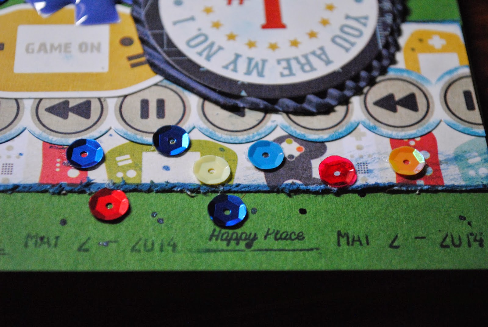
  • Since I hated the bricks, I started layering over them -- stickers, journal spot.  Initially, I wasn't going to use a journal spot; but I didn't leave space at the bottom for journaling.  Plus, it was more navy to combat the green.


  • And the sequin party!  Whee!  Followed by more decluttering of my desk -- the enamel pieces.  Also, I found a roller-date stamp just hanging out, wishing for some love. 


If I owned a stamp that was shaped like a video game controller, I would have thrown a couple of those images onto my page as well.  Trust me, I'm looking!  Until that magical day arrives, this page is "done."    If you're interested in learning about the products I used, here is the link to my gallery at scrapbook.com.

 http://www.scrapbook.com/myplace/index.php?mod=galleries&u=376301&m=view&id=4239263&type=-1&size=0

Thank you for looking!

Monday, June 9, 2014

Pitch Perfect?

Good Monday Morning!

I have another page to share with you.  This is my submission to the White With 1 challenge; pomegranate.  This is what I came up with:


This was a fun (read: slightly crazy) page to put together.  When the prompt was first posted, I had no specific photos in mind.  While I really wanted to work with a nice dark red (again), I had to make myself wait until it all clicked for me. Finally, there was a moment of fun in the back yard....followed by some fun with my favorite photo editing app, PicsArt.  After messing with the Color Splash option, picking out the red in their shirts, I knew I was ready to begin this challenge.  Then came the....

Confession of a Challenge Junkie:  At the same time, I really wanted to use one of the prompts in the June Page Maps challenge at scrapbook.com.  Problem:  You can't combine other challenges with White With 1 prompts.  I had to make a choice.  Obviously, we can tell which I chose, but this is why I've got the woodgrain in the background:


It's actually a combination of stencil + modeling paste + mist (added to the paste for color) + a layer of ink on top to darken the red further.


Originally, the photos were supposed to print out smaller, to follow the sketch more closely, but they were cut off and just bad.  In order to see people, I had to print larger.  Grr!  Still, I like it, because I can actually see what's happening.

Aside from the buttons, all of the other elements were pretty much "findings" on my crafting table.  They've been lurking between several months to a year.  I've tried adding them to countless pages, but they never worked.  This was their day!

I believe that's everything I wanted to say.  The product list is so short and/or hard to find, I might as well share here:

  • woodgrain stencil:  Prima Marketing
  • mist (mixed with modeling paste):  Tattered Angels, Red Velvet
  • ink (dabbed on top of dried modeling paste for more color):  Prima fluid chalk edger, Lady Bug
  • red text embellishments:  Theresa Collins (I'm pretty sure on that one; they really came from a Scraptastic kit), Family (something.... I'm horrid here)
  • other red text/arrow:  Basic Grey; (pretty sure) Bow Ties
  • red label:  Studio Calico printable
  • Title alphas:  Jenny Bowlin and October Afternoon
  • Pinked circles:  Jenny Bowlin
  • airplane strip:  Echo Park, That's My Boy
Thanks for looking.  Have a great day!

Friday, June 6, 2014

Hello Handsome Part 2 of 3

Good morning! As promised, I have the complementing page to share today.  This page will be my submission for two challenges at scrapbook.com AND another new site that I dig, Scrap & Play.

 The Scrap &Play challenge is to choose a column or row from their bingo card. I chose the vertical row of buttons, Fancy Pants product and chipboard. This is what I created:


 The Boy and I needed help with his tie on Easter Sunday. Papa to the rescue! While my dad cleaned up my attempt, I snapped photos. Later, when I reviewed the hundreds of Easter photos, I noticed all of these silly faces. I was equally amused and reminded of how much he complained. These photos told part of the story of being dressed up.

 The design is based on a Page Maps sketch, which is part of the Page Maps challenge at Scrapbook.com.


I stayed fairly true to the sketch and tried to keep to an almost monochromatic color scheme.


I used the collection, Be Different, by Fancy Pants. The monsters used in each cluster have been fussy cut from patterned paper.


I'm glad I have the title pieces in my stash. The Boy Oh Boy piece was really helpful (and easy) when filling the center with an interesting shape.  I added "funny" to this piece to keep with the point, that his faces crack me up.


Want more information about the products used to make this page? Here's a link to the gallery submission at scrapbook.com.

 http://www.scrapbook.com/galleries/376301/view/4234075/-1/0/0.html

Most of the items I've used will be listed there.  Thanks for looking!  You're more than welcome to return tomorrow to see the two pages together.  Personally, I think it looks better than having them apart.

Thursday, June 5, 2014

Hello, Handsome! Part 1 of 3


Good Morning!  Yes, you read that correctly, this is one of three related blog posts.  Why three posts for one (possibly mediocre) page?  So glad you asked, because I have another....

Confession of a Challenge Junkie:  What I'm sharing today is my submission for the June challenge at Scrap the Boys.  This month, the challenge is to use a photo, 5x7 or larger.  I LOVE using large photos, and I knew that I wanted to use a large photo of DS and my dad after getting the Easter Sunday tie to submit to the human will.  Also, Holy Moly, I got The Boy into a tie AND smiling!  However, there is more to the story, so there is a complimentary page that I will share tomorrow.  It is focused on other challenges.  Then, because I like how the two look together, there will be a third post, just showing that.  If I didn't love challenge sites so much, this would have been much more straight forward.

Anyway, on with the share?


  • I attacked the background with a texture stamp that I've owned for about six years. I hardly ever use it, but today must have been it's lucky day.  
  • My little monsters are fussy cut from a sheet of Fancy Pants, Be Different paper.  
  • The "Be Different" is cut from the branding strip.  It's a message I want my son to absorb often, so I'm trying to incorporate them whenever I can.


  • These layers included more fussy cutting (that little banner on the bottom), a very distressed plaid paper ruffle and a left-over strip of glittered paper.  
  • Also, may we have a moment of silence for my little Prima edger that was torn apart while inking that glitter paper.  Literally, it's in two pieces now....


  • The bits of vellum are leftovers from the creation of the coordinating page.  I cannot bring myself to waste a single bit of vellum that I stocked up on, so even my mistakes are getting reused whenever possible.


And that pretty well sums up this page.  Thanks for looking!  If you're interested in learning which supplies I've used, most will be linked in my gallery post at scrapbook.com  You're more than welcome to return tomorrow, if you'd like to see the rest of this three-ring circus! ;)

Monday, June 2, 2014

The Tooth Fairy Came!

Good Monday morning!  Did you enjoy your weekend?  I certainly did; so much blue sky and sunshine made for an excellent mood; especially Sunday.

Confession of a Challenge Junkie:  I've been waiting a few days for May to hurry up and get over with.  It was a great month, I had a lot of fun with paper and paint, but I also started to find myself very drawn to a few specific challenge sites.  That's only a problem because the month was ending and there was NO way I was going to meet challenges that close to deadline.  Instead, I made a list of my Absolute Must Do's and Just In-Casers.  Sunday morning, I was in Scrappy Challenge Heaven, and the DH was willing to let me obsess and play with my paper and inks for most of the day.  He's the best!

That brings me to what I'm going to share today.  I have gained a little more interest each day in the site, Scrap Our Stash . For June, they are issuing a Monochromatic Challenge.  THAT rocked my bobbysocks because I LOVE making monochromatic pages.  It's a really comfortable way to play with a lot of different elements but still keep focused on the photo.  It's also usually how I give myself permission to play as much as I want.  Ergo, this:


To keep in line with the challenge at Scrap Our Stash, my five pre-packaged elements include wooden smilies, sequins, stickers, buttons and enamel accents.  The overall design was inspired by a sketch challenge at Scrapbook.com (and I'm SO thankful that I can combine the two!):


I moved the photo to the left and changed the direction of the strip elements:


The top-left and center elements are pretty basic.  I colored the Freckled Fawn (total coincidence!) smilies to match the page; though I look forward to using them bare someday. I cut the rocket ship sticker in half to use on either side of the photo.  I used the enamel arrow to point out the journaling to the right.


The bottom cluster includes a tail and banner, attached to the plane, It's actually part of the branding strip that was at the bottom of the airplane patterned paper.  I tried to get the strip to blend in more with the page by mixing water and a Tim Holtz marker as a fake watercolor treatment.


Beyond that, the background was initially going to be a bright white/ modeling paste brick pattern.  After I had looked at all of that white for a few hours, I just couldn't stand it anymore.  It was distracting me, so I started attacking it with every red ink in my stash.  I brushed a Distressed ink over the surface, then used a wet paint brush to spread the color.  That helped, but it was a little too pink.  More must be better, right?  I then tried a Prima chalk ink, which deffinitely helped add more red.  Still, I remembered that I needed to add splatters (a twist at sb.com) so I sprayed the background with mist.  Bingo!  Then I pulled out that same brush from before, dipped into the mist and splattered my lil heart out.  I was going to add a final light coat of glitter glue to select bricks, but I had decided I was done.  Done I shall be.

Curious about which products I used?  Since I'm entering this page in two challenges at scrapbook.com, here is a link to that gallery. Most products are listed there.

 http://www.scrapbook.com/myplace/index.php?mod=galleries&u=376301&m=view&id=4231021

Thank you for looking!  Thank you for the metric ton of inspiration.  This was fun; exactly as it should be.

Wednesday, May 28, 2014

Without Even Trying

Hello again!

 I have another page to share; this time it's inspired by the White With 1 Challenge blog. The May challenge is White with Gold. This was perfect for me because I recently decided that I needed a lot of gold schtuff. Sure, I see it's quite fashionable right now, but also my son has taken a liking to all things gold. Not even my crafty stash is safe! Here is my submission:


Much of the embellishment on this page is thanks to the recent acquisition of gold embossing powder.  I've known for months that I wanted some, so I finally broke down and got some.  Yeah, I think I like it. 


Other details were on a whim:
  • I used a brick stencil (my favorite) to spray a nearly-invisible layer onto the white cardstock.  It helped me focus.
  • Around the photo, I painted some of the bricks with a layer of gold glitter glue, like an extended frame.
  • I added water to some gold acrylic paint for splatters.
  • I then used the too-much leftover to paint the frame...that also has random leftover glitter glue.
  • From the hexagon matting -- which was originally a whim of just playing with the embossing powder -- I cut a random arrangement to add to the bottom corner.
  • To highlight the matting, I ran my embossing dauber along the edges, dipped in powder and embossed for a distressed edge.
  • The nautical stars were cut, using the Indie Cartridge (Cricut); and I couldn't help but use the negative space for a variation with the stars.

I think that sums it up.  Again, thank you for looking.  I'm excited to see what the color combination will be for June.

My New Favorite Photo

Good Wednesday morning! I have some time to sit still, but my brain wants to keep going. Why not use both to share a page with you? I  have a submission for the May challeng at Scrap the Boys?  Hmm, my technology is challenged today, so here is the direct address:  http://scraptheboys.blogspot.com/2014/05/may-challenge.html I've actually loved this site for a long time, even when I've been quiet in blogging land. The challenge to get grungy and messy was the perfect inspiration for my new favorite photo.


While I have dabbled in grungy techniques before, this was definitely a challenge for me, and it took weeks to decide what I would do and when it felt done. I think I used nearly every technique possible, but I'm willing to be schooled to learn more. On this page, I:
  •  tore, masked (with paint and spray) and generally misted the corrugated paper. 
  • distressed and inked every paper edge visible, even the vellum matting.
  •  used my favorite brick stencil to emboss the rocket ship paper, then fill in the spaces with orange ink.
  •  The orange and teal arrows below the photo started as orange and white ribbon, inked with teal, misted brown and I shredded the end of each.
I probably could have sanded something,  but I finally feel like I met the challenge, and have a starting point to get grungy again. It felt good to get dirty and just play.

Thank you for looking. I look forward to trying the June challenge, soon.


Thursday, July 21, 2011

Bella Creations Tiny Dancer Tag

Good Thursday Morning! I thought I'd pop in quickly to put something pretty in this space. Many of you know already that I have a special love for the site, Bella Creations. It's such a rich source of inspiration for any kind of crafting you enjoy. If you haven't heard of them yet, I encourage you to check them out!

In the month of July, they've had loads of amazing challenges. I'm still working on some, but I'm pretty pleased with the tag I created, thanks to the Oh La La group.


The image of the weary ballerina is courtesy of Gecko Galz Scrapbooking -- loads of stunning digital images! At first, I found myself wondering why she was so tired; perhaps she danced just a little too much that evening. Perhaps she's been burning the candle at both ends, like so many Super Women on this rock. This sounds like a few of my closest friends.

Over the course of a few days, I thought about this image and my friends. Eventually, my thoughts lighted on a song by Cage the Elephant. It seemed a perfect fit; especially since one of my candle-burning friends has been telling me for fifteen years, "I'll sleep when I'm dead." This lead me to insert a piece inside the tag; just for her.


Below, I found the song on You Tube. If you like your music punky, I encourage you to click and enjoy for a few.

....It could be argued that this is a darker take on the challenge. I think I'd agree. I've been in a dark/funny/fighter frame of mind for a while now. It keeps me going.


Friday, March 4, 2011

Friday Finds 7: Mostly, the Challenge Issue


Good Friday Morning! As promised, I have some fun finds today. A few of them are from sites that I've never really highlighted on my blog before. Yay for something new! I realized as I was lining up the sites for linkage that there were a lot of challenges that I was sharing today. Most run for the entire month so there's plenty of time to fit them into a purty packed schedule.

Ready? Great! Now, let's start with one that is so not a challenge because I live for contradiction.

* Mandy, who runs an amazing blog by the name of For Scrapping Out Loud is hosting a Dusty Attic giveaway. Check these out:


I'm digging them because there appears to be more space on these to have even more fun. The buttons were what drew me in. I've used up pretty much all of my circular chipboard stash and like to design my own buttons.

And for the challenges:

ARTastic Challenge Blog is a site I've visited long ago. It looked fun, but made my newbie head swim. I stumbled upon it again this past week and really like their colorful prompt for March. Check out their blog for all the details:


Scrapbookers Anonymous is suggesting the use of at least 7 flowers on your layout this month. The stipulation is that they are pre-packaged. Considering I'm still trying to use up my flowers from last Mother's Day, this appeals to me.

ScrapFIT is another site I found very early in my blogdom, but felt overwhelmed by. In March, however, it's an easy challenge -- bling it up, baby!

Now, you had to know that I'd share at least a little of Bella's Creations! It's a new month and they've got new challenges. I've already shared their color challenge -- yesterday's post -- but there's more!

They have introduced a new monthly challenge in March; Bella Unique. In the unique challenge, they plan to introduce a new technique for their members to try. Currently, they've introduced "Selective Colorization." Because I want you to go read and enjoy, I'll leave it at that. But I will say it looks so flippin' cool that I'm just waiting and plotting for a moment to capture on camera so I can do this.

They are also bringing back the Tres Chic challenge with a focus on Vintage projects. This month, they are sponsored by the kit club Scraps of Darkness as well. Go check it out!

Drat! It sounds like my time is up. Guess I'd better get my coloring and painting game together! Thanks for visiting!

Thursday, March 3, 2011

Tormented Artist as Inspired by Bella Creations Nuances de Couleur

Good Thursday Afternoon! I hope this afternoon finds you as well and happy as I am. I have my usual beginning-of-the-month pep and my health is returning so I thought it was time to feed my passions... and evidently stir some long-lost loves in my son's own heart, to boot!

This is what I've spent the last 24 hours obsessing about:


It's my submission for the March Nuances de Couleur at Bella Creations. The challenge is to use the colors brown, orange, green and yellow. It's also required to include a stamped image and pop-dot something on the project. Considering the fact that I'm in a very Crayola-8-pack frame of mind, this should have been easy peasy! Once I got going, it was, but I also wanted to at least try and create something that would fit in the Bella Gallery at the same time. If you want a serious case of the wow's, go check out the gallery. Amazing, yes? They know how to set a bar!

At any rate, I wanted to show off a few of the details that I'm pleased with; like the skull and crossbones. It's the last of my Tim Holtz Grungeboard skull elements. I haven't been able to find them lately; and I don't really want to buy a package with everything to have extras of other stuff. I need a die cut of some sort because this is my favorite element to add. *sigh* I painted this one orange and then used Basic Grey Archaic stamps. I added a couple pieces of Prima E-Line bling to the eyes and used my last brown flourish from Steffanie.


Here's a close-up of the pop-dotting on the skull. I know it can be tricky to detect sometimes.


I was just proud of myself for deciding on a few Prima flowers to add. Mainly, they satisfy some odd need to add flowers to Tim Holtz tickets. It's just one of my "things" lately.


If you're still wondering what drove me to create this page, I'll dish. Two nights ago, we were present for my mom's unboxing of some Polish stoneware she had ordered (her current obsession). Two of the boxes looked so nice and clean and white and unlike the normal brown taped-up boxes. She planned on tossing them, but I couldn't bear to let such great potential go to waste. I painted one red for my son to house his growing marker collection (you know, The Rainbow Master).

He so enjoyed decorating that box that he wanted to paint the other all on his own; and I let him. Somehow, I also ignited his love of painting things. He made up and sang songs about being an artist; painting the box green; you name it! When it was all done, he wanted to paint another. I had no other. He moped and whined for about an hour; so very heartbroken that his painting was now done.

....Until this afternoon; when we discovered another box from another Polish stoneware shipment.


And that's all I have for now. I've already started the Friday Finds post for tomorrow and looking forward to posting it. Thanks for looking and have a good day!

Friday, February 11, 2011

Friday Finds 4

Good Friday Morning! I've done a little more wandering around the blogosphere and have a few bits and bobbles to share with you. Are you ready? Alrighty then!


First up (and I have NO idea how I wound up underlining everything!)Is a cute little sketch from Page Maps:


This month, Becky Fleck is giving away a very generous prize -- a whole lotta Basic Grey!!!! The goodies are mains from the Wander, Curio and Pyrus collections, which I love, so I've got my submission nearly done. I look forward to sharing it soon!

Looking to join a Design Team? Enjoy working with a variety of projects and challenges? Frosted Designs has put out the call for anyone interested in joining their Design Team. Truly, it's a great site and they have loads of inspiration every week. I do recommend checking them out!

Through a series of clicks, I've JUST recently come across a new site that I'll be checking out. Understanding a few trends that are out there right now, I think many others would be interested, too. The Altered Alice is all about the love of Alice in Wonderland. They are running a challenge this month, with a focus on "Changes In Form and Dress Forms." I think many would have fun with this.

One last share! I saw a really cute paper-crafting project on White Racoon's handcrafts. I'm normally a lurker on her blog, but love the ideas she comes up with. Because of being a lurker, I don't feel confident sharing a picture of her craftiness here. Silly me, I only asked for permission on Thursday morning, so.... Regardless, it's a cute project and I encourage you to check it out.