And here is my take:
I guess the first thing I want to talk about is the cardstock. Of all things, right? Apparently, I have a love/hate relationship with this shade of green. I love singing like Kermit The Frog about how it's not easy being green. I love the shade. I hate working with it; but I'm stubborn. Each year, I give myself permission to invest in a new "boy" collection and coordinating cardstock. This shade is actually spot on with a few of the papers in the "Be Different" collection from Fancy Pants, so it was a natural choice.
- Problem: Every time I pull it out to make a page, my eyes get mad at me, taking my brain along for the ride.
- Solution: Every time this happens, I put it back and choose a different color.
- Problem: I've run out of two of the other colors I prefer (light blue and vanilla).
- Solution: I've ordered more.
- Problem: I REALLY wanted to make a page -- apparently this page -- yesterday and Oh! Em! Geeeeeeeeeee! How was I going to make this work?!
- Solution: Throw as much navy (everything) as I could around the photos to help me chill out. That started with two different blue mists, blue ink with stencils, and any blue embellishments I could find. I began to settle into some comfort with my page, but then there was a very blank, massive corner of green along the right. Gah! More mist, still bugged me. Then I just decided to listen to the little voice inside my head. I tested my idea first; by painting hearts with plain water, I would at least get to see if I liked the shape and knew it would dry clear. Once that was a go, I dipped my brush into a bottle of glimmer mist to paint heart shapes...then I felt compelled to fill them in. Almost there; I used a bottle of Mister Huey's and traced the outside with that tiny tube/ spray pump/whirlygig..... In the moment I'm typing this, I'm mostly happy, but I still think they might need something more; maybe a little yellow triangle in each. Maybe time will tell.
Check! So now I can talk about everything else:
- My literal brain would have popped if I didn't choose the gaming paper for this page. It is, afterall, about The Boy and one of my dearest friends playing Skylanders together. He got her hooked on a previous visit so this was pretty special for them both.
- Again, I played with Pics Art photo editing to choose two colors in the photos, making the rest B/W. I think I do that more for my benefit, so I can better focus on what I feel is important -- not the messy sofa and coffee table.
- I went back to my early days and traced a saucer for the corrugated circle; then folded that circle in half to cut out the inside. I then cut that ring in half and wove it between my paper layers.
- Instead of using another paper for a large banner underneath it all, I opted to use a stencil and ink. Then, I was compelled to pull out my trusty brick stencil as well. Mainly, I was just trying to fight all of the green with more blue around the photo. I hated it.
- Since I hated the bricks, I started layering over them -- stickers, journal spot. Initially, I wasn't going to use a journal spot; but I didn't leave space at the bottom for journaling. Plus, it was more navy to combat the green.
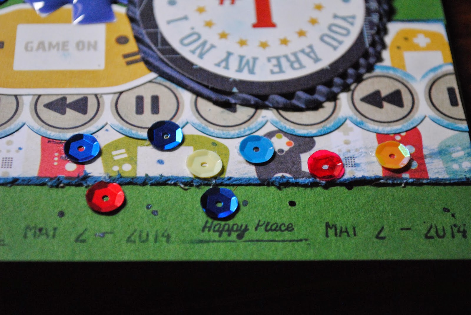
- And the sequin party! Whee! Followed by more decluttering of my desk -- the enamel pieces. Also, I found a roller-date stamp just hanging out, wishing for some love.
If I owned a stamp that was shaped like a video game controller, I would have thrown a couple of those images onto my page as well. Trust me, I'm looking! Until that magical day arrives, this page is "done." If you're interested in learning about the products I used, here is the link to my gallery at scrapbook.com.
http://www.scrapbook.com/myplace/index.php?mod=galleries&u=376301&m=view&id=4239263&type=-1&size=0
Thank you for looking!


